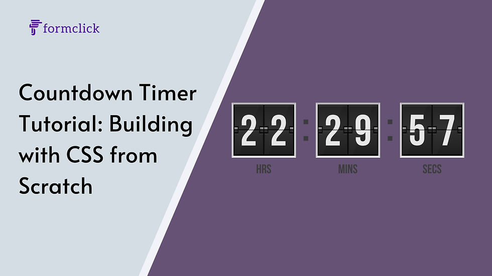
Creating a countdown timer is a common requirement for many web projects, especially when you want to display a countdown to a specific event like a sale, product launch, or deadline. While JavaScript is often the go-to solution for creating timers, CSS alone can be surprisingly powerful for crafting a visually appealing countdown timer. In this tutorial, we’ll build a countdown timer using pure CSS, breaking down each step to help you understand how it all comes together.
1. Understanding the Basics
Before diving into the code, it’s essential to understand the limitations and possibilities of using CSS alone for a countdown timer. CSS is primarily a styling language, meaning that while it can handle visual presentation and some animation, it doesn’t manage logic or state changes well. However, for a static timer or one with simple animations, CSS can be a powerful tool.
Key Concepts:
CSS Variables: These allow you to reuse values throughout your CSS and can be dynamically changed using JavaScript if needed.
Pseudo-elements: Elements like ::before and ::after can be used to create parts of the timer without adding extra HTML.
CSS Animations: Using @keyframes, you can animate the countdown timer to create visual effects.
2. Setting Up the HTML Structure
The HTML structure for the countdown timer will be minimal. We'll use basic HTML elements and rely on CSS for most of the styling and animation.
html

<div class="countdown">
    <div class="countdown__item">
        <span class="countdown__number">10</span>
        <span class="countdown__label">Days</span>
    </div>
    <div class="countdown__item">
        <span class="countdown__number">23</span>
        <span class="countdown__label">Hours</span>
    </div>
    <div class="countdown__item">
        <span class="countdown__number">59</span>
        <span class="countdown__label">Minutes</span>
    </div>
    <div class="countdown__item">
        <span class="countdown__number">42</span>
        <span class="countdown__label">Seconds</span>
    </div>
</div>
This structure is simple but flexible. Each countdown__item represents a unit of time, with the number and its corresponding label (days, hours, minutes, seconds).
3. Styling the Countdown Timer with CSS
Now, let's style the countdown timer to make it visually appealing. We'll start by setting up basic styles for the container and the individual time units.
css

.countdown {
    display: flex;
    justify-content: center;
    align-items: center;
    gap: 20px;
    font-family: 'Arial', sans-serif;
    background-color: #333;
    padding: 20px;
    border-radius: 10px;
    color: #fff;
}

.countdown__item {
    text-align: center;
}

.countdown__number {
    font-size: 2.5em;
    font-weight: bold;
    display: block;
}

.countdown__label {
    font-size: 1em;
    text-transform: uppercase;
    opacity: 0.75;
}
In this CSS snippet:
The .countdown class is used to center the countdown timer and style the background.
Each .countdown__item is centered and has a margin between them.
The .countdown__number is styled to be bold and large, making the time value the focus.
The .countdown__label is smaller and slightly transparent, ensuring it doesn’t overshadow the numbers.
4. Animating the Timer with CSS
CSS animations can add some life to your countdown timer. For example, you might want to create a simple pulse effect when the timer updates.
css

@keyframes pulse {
    0% {
        transform: scale(1);
    }
    50% {
        transform: scale(1.1);
    }
    100% {
        transform: scale(1);
    }
}

.countdown__number {
    animation: pulse 1s infinite;
}
In this example, the pulse animation slightly enlarges the number and then returns it to its original size, creating a subtle breathing effect.
5. Adding Interactivity with CSS Variables
CSS variables can make your countdown timer more dynamic. For instance, you can use CSS variables to change the color scheme based on the time left.
css

:root {
    --time-color: #ff4757;
}

.countdown__number {
    color: var(--time-color);
}

.countdown[data-time="short"] {
    --time-color: #ff6b6b;
}

.countdown[data-time="medium"] {
    --time-color: #ffa502;
}

.countdown[data-time="long"] {
    --time-color: #2ed573;
}
You can dynamically change the data-time attribute using JavaScript to reflect how much time is left, and the color will update automatically based on the value.
6. Advanced Styling Techniques
To make your countdown timer stand out, consider some advanced CSS techniques:
Circular Countdown: Using conic gradients and CSS animations, you can create a circular countdown timer.
css

.countdown__circle {
    width: 100px;
    height: 100px;
    border-radius: 50%;
    background: conic-gradient(#ff4757 calc(var(--percentage) * 1%), #333 0);
}
Flip Animation: Simulate a flip clock effect using 3D transforms.
css

.countdown__number {
    perspective: 1000px;
}

.countdown__number::before {
    content: '';
    display: block;
    width: 100%;
    height: 50%;
    background: #333;
    transform-origin: bottom;
    animation: flip 1s infinite;
}

@keyframes flip {
    0%, 50% {
        transform: rotateX(0);
    }
    51%, 100% {
        transform: rotateX(-180deg);
    }
}
7. Conclusion
Building a countdown timer with CSS from scratch is not only a great way to showcase your styling skills but also an opportunity to explore the full potential of CSS. While JavaScript may be necessary for a fully functional countdown timer, CSS alone can handle the visual and interactive aspects beautifully.
By combining CSS variables, animations, and advanced styling techniques, you can create a unique and dynamic countdown timer that enhances your website’s user experience. Whether you’re counting down to a sale or a new product launch, a well-designed countdown timer can create excitement and urgency for your audience.

Comments